Hello there I’m following the react-native tutorial on the expo go docs this.
I’m previewing my app via the expo go app. Through which we can open our app with the help of a qr code.
this way
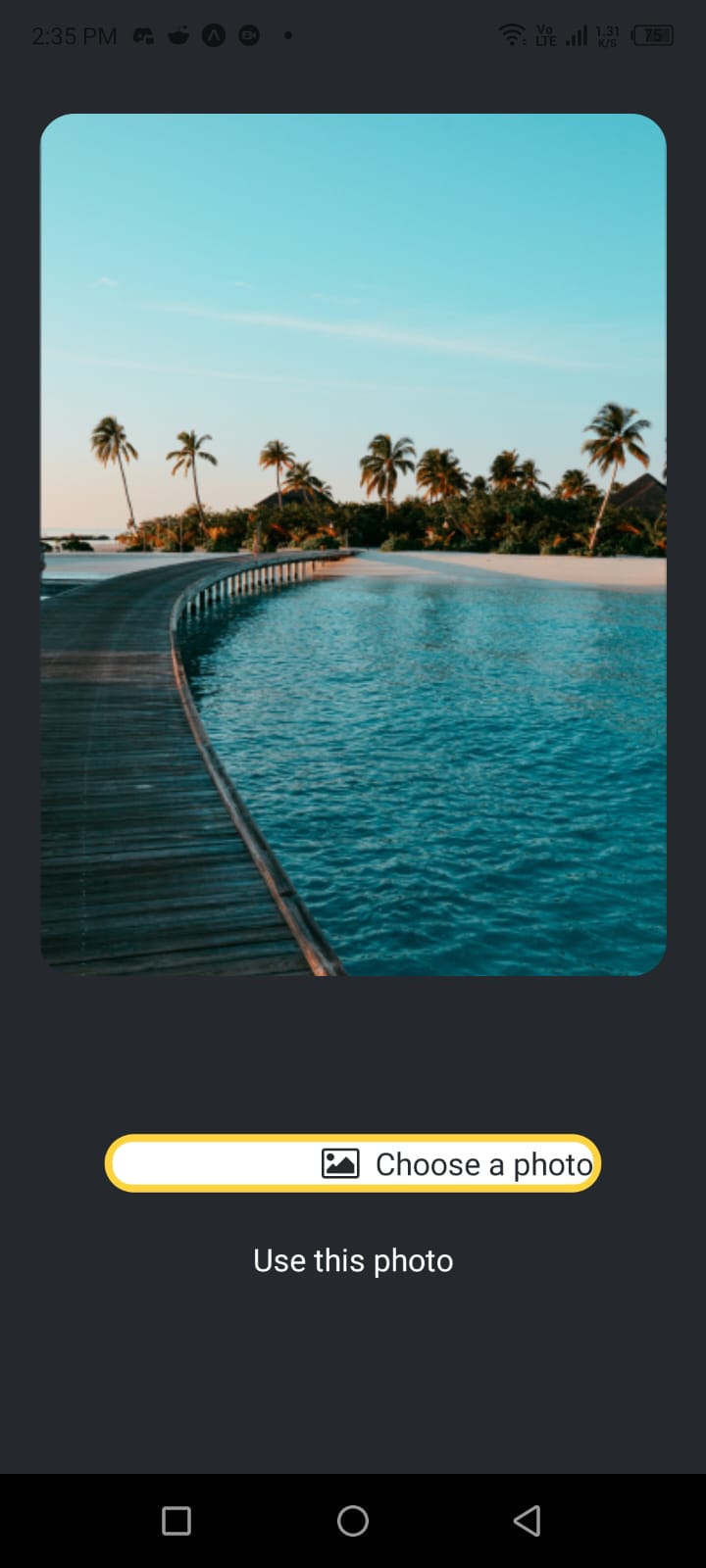
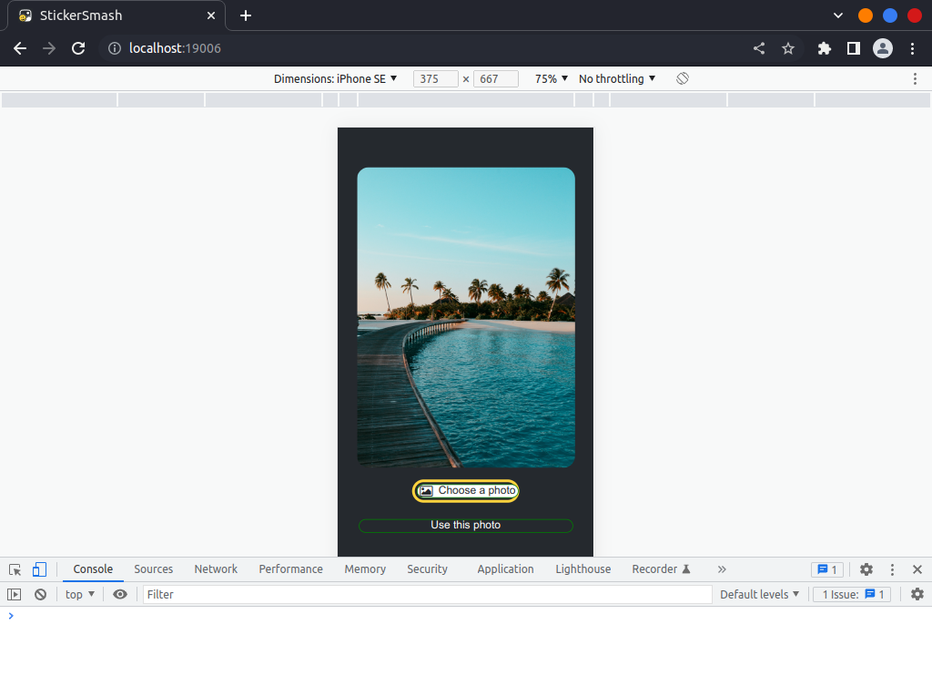
But I don’t know why in the mobile preview, some left padding added to the first button.
here is the image mobile-preview. But no left padding when I view with chrome browser image preview browser-preview
This is the code of button Component:
`
import { StyleSheet, View, Pressable, Text } from "react-native";
import FontAwesome from "@expo/vector-icons/FontAwesome";

export default function Button({ label, theme }) {
	if (theme === "primary") {
		return (
			<View
				style={
					([styles.buttonContainer],
					{
						borderWidth: 4,
						borderColor: "#ffd33d",
						borderRadius: 18,
					})
				}
			>
				<Pressable
					style={[styles.button, { backgroundColor: "#fff" }]}
					onPress={() => alert("You passed a button")}
				>
					<FontAwesome
						name="picture-o"
						size={18}
						color="#25292e"
						style={styles.buttonIcon}
					/>
					<Text style={[styles.buttonLabel, { color: "#25292e" }]}>
						{label}
					</Text>
				</Pressable>
			</View>
		);
	}
	return (
		<View style={styles.buttonContainer}>
			<Pressable
				style={styles.button}
				onPress={() => alert("You clicked me!")}
			>
				<Text style={styles.buttonLabel}>{label}</Text>
			</Pressable>
		</View>
	);
}

const styles = StyleSheet.create({
	buttonContainer: {
		width: 320,
		height: 68,
		display: "flex",
		marginHorizontal: 20,
		alignItems: "center",
		justifyContent: "center",
		padding: 3,
	},
	button: {
		borderRadius: 10,
		width: "100%",
		alignItems: "center",
		justifyContent: "center",
		flexDirection: "row",
		borderWidth: 1,
		borderColor: "green",
		margin: 3,
	},
	buttonIcon: {
		paddingRight: 8,
	},
	buttonLabel: {
		color: "#fff",
		fontSize: 16,
	},
});
This is the App.js component code:
import { StatusBar } from "expo-status-bar";
import { StyleSheet, Text, View, Image } from "react-native";
import backgroundImg from "./assets/images/background-image.png";
import ImageViewer from "./Components/ImageViewer";
import Button from "./Components/Button";

export default function App() {
	return (
		<View style={styles.container}>
			<View style={styles.imageContainer}>
				<ImageViewer backgrondImageSource={backgroundImg} />
			</View>
			<View style={styles.footerContainer}>
				<Button theme="primary" label="Choose a photo" />
				<Button label="Use this photo" />
			</View>
			<StatusBar style="auto" />
		</View>
	);
}

const styles = StyleSheet.create({
	container: {
		flex: 1,
		backgroundColor: "#25292e",
		alignItems: "center",
		justifyContent: "center",
	},
	imageContainer: {
		flex: 1,
		paddingTop: 58,
	},
	footerContainer: {
		flex: 1 / 3,
		alignItems: "center",
	},
});
I’ve tried to look in both button styling carefully. Even tried adding display flex and justify content and align items to center on the first button Pressable component inline style. But No success.
I am expecting the Choose a photo text along with its icon should be in the middle.
I am thinking there is some problem with the expo go app itself.
Can anyone please help me to understand what’s wrong here?
Thank You!!